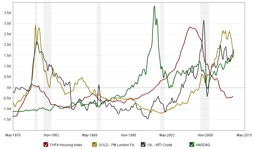
I enjoy looking at Economic Trends. I can stare at a graph like the one below for a very long time.
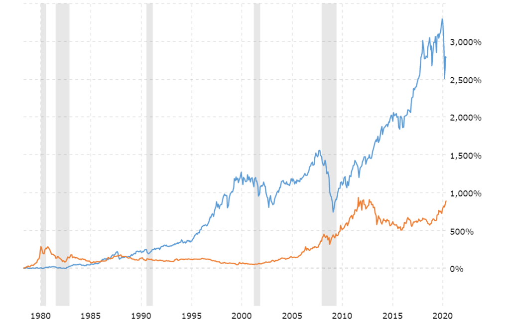
In this particular graph, the benefit of investing in gold (gold line) is compared to the benefit of investing in the stock market (blue line). Way back in 1980, it seemed like a very good idea to invest in gold, which was outperforming the stock market in a big way. But investing should be long-term and the stock market has since outperformed gold by 6x. Of course, I have the benefit of history when I make these observations but I think there is a lot to be gleaned from economic indicators like these. I like to stare at these charts, along with other indicators, and make economic assumptions, which help me perform my role.
If you want to visit this interactive graph as well as other economic indicators, click on it or go to http://www.macrotrends.net/